
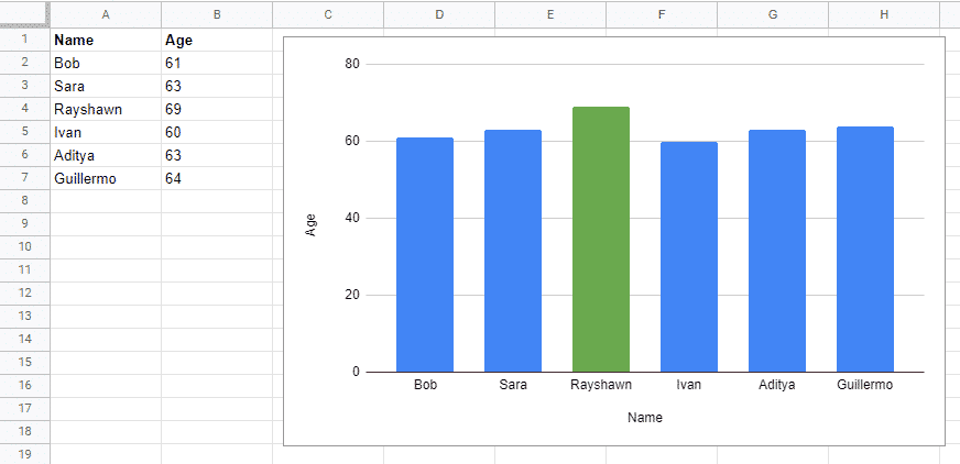
The way data is graphically presented, aka data visualization, can make such a huge difference in what conclusions are drawn and also how quickly decision can be made. It’s a super simple example, but just with the spreadsheet vs. graph below, it’s so much easier to see who the oldest person in the group is with the visualization, rather than with just the table.
While having the raw data to back up the visuals can often be something business leaders want to have to fall back on, the graphical interfaces are generally much more helpful when dealing with reporting, presenting results, or displaying change over time. This point, along with many others at the intersection of marketing and data are exactly what we touched on last week on episode 10 of Optily Radio with Michel Guillet of SalesLoft and our own TJ Sizemore.

Who are Michel and TJ?
Michel Guillet is Senior Product Manager of Reporting, Analytics, and Data Science at SalesLoft. He is a creative product leader with over 10 years of experience in information product management and data products. He also currently teaches at Georgia State University as an Adjunct Professor of Data Visualization. In addition, he also lectures at the General Assembly Atlanta in Data Analytics.
TJ Sizemore is Optily’s Director of Data and Analytics and heads up the creation of our data-driven predictive models for ad spend optimization. He has over a decade of experience in Data Analytics, with extensive experience with some of the big names in eCommerce including Coca-Cola, Home Depot, and Kohl’s. He completed both an MBA and a Master’s in Analytics from Georgia State University, where he took a Tableau workshop led by Michel.
Know your audience
Just as with doing the actual marketing, when presenting marketing data you need to tailor your approach to your audience. Are you sending a 2-page summary report to a CEO who has about 30 seconds to digest it? Or are you giving a quarterly update PowerPoint where you have an hour to explain everything in detail and take questions? It’s really important to recognize a whole bunch of factors when building out your visuals, including:
- Time constraints
- Familiarity with the data
- Self-guided or presented visuals
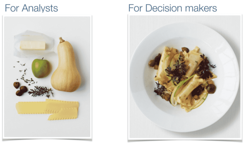
Michel points out that what works for analysts isn’t going to always mean the same to business leaders. Basically, keep your scatterplots to yourself.
A great analogy Michel uses is a cooking one. While a skilled chef can easily imagine what a finished product with looks and tastes like, a typical restaurant patron needs to see the final product.
Storytelling with data
This all flows nicely into Michel’s next point on storytelling. Essentially, you’re looking to paint a picture with the numbers and show this information to the decision-makers. In order to do that, the data needs to be leading to some kind of point in the most direct way possible.
Michel acknowledges that this can sometimes be interpreted as a bit underhanded as a way to serve one agenda over another, but it’s not. Data analytics exists in order to process huge amounts of marketing and sales information into something usable. It serves to educate, rather than manipulate.
TJ brings up the repeated question that he keeps encountering from marketers and business leaders: “Where is the table?” Michel points out that there may be a level of trust that needs to be established. Sometimes a table that can be toggled with the raw data achieves just that.
While they’re not pretty to look at, having that background data in a separate tab or expandable from within an interactive visualization tool can help analysts tell the story they want, while providing the decision-maker with an extra layer to fall back on.